Data Components
Hidden
A hidden field can be added to a form to create a resource property that can be custom set in the form. You can use javascript to set the value on the client side and when the form is submitted the value will be set on the resource. There is no front end widget for hidden fields.

Name
The name for a hidden field is not displayed on the client side and is used for administration purposes only. The name is used to generate the automatic property name but this can be changed on the API tab on the component settings modal.
Custom CSS Class
A custom CSS class to add to this component. You may add multiple class names separated by a space.
Unique
If checked, this field will be enforced as unique for this form. Submissions will be checked to see if an existing value matches. This validation is currently server side only.
Protected
If checked, this field is for input only. When being queried by the API it will not appear in the properties and also should not appear in exported data. You won’t be able to see the value on form.io, but it will be stored in database under the hood.
Persistent
If checked, the field will be stored in the database. If you want a field to not save, uncheck this box. This is useful for fields like password validation that shouldn’t save.
Table View
If checked, this value will show up in the table view of the submissions list.
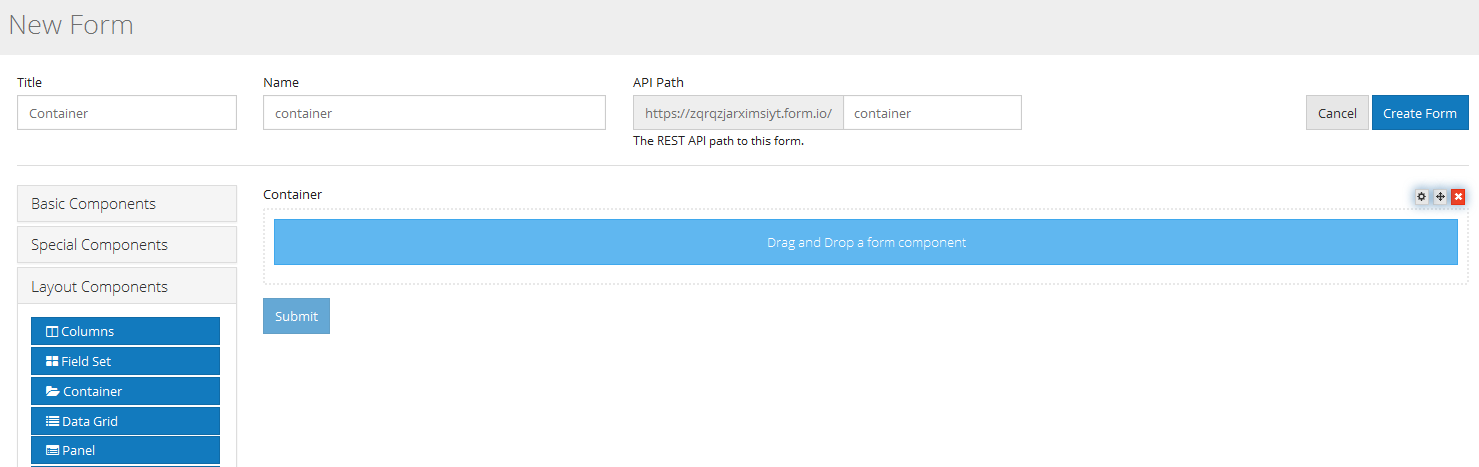
Container
A container is a wrapper around a set of fields similar to a fieldset. The major way they are different is the way that the data is stored. For most layout components field values are stored directly in the data of the submission.
For example, a fieldset with the following fields
firstName = First Name field lastName = Last Name field Would submit as
{
  data: {
    firstName: “Joe”,
    lastName: “Smith”
  }
}
However, with a container, the fields are put into an object with the container key. This is useful for creating more complex objects within your form.
For example, a container with the key user and the same fields above would submit as
{
 data: {
    user {
      firstName: “Joe”,
      lastName: “Smith”
    }
  }
}
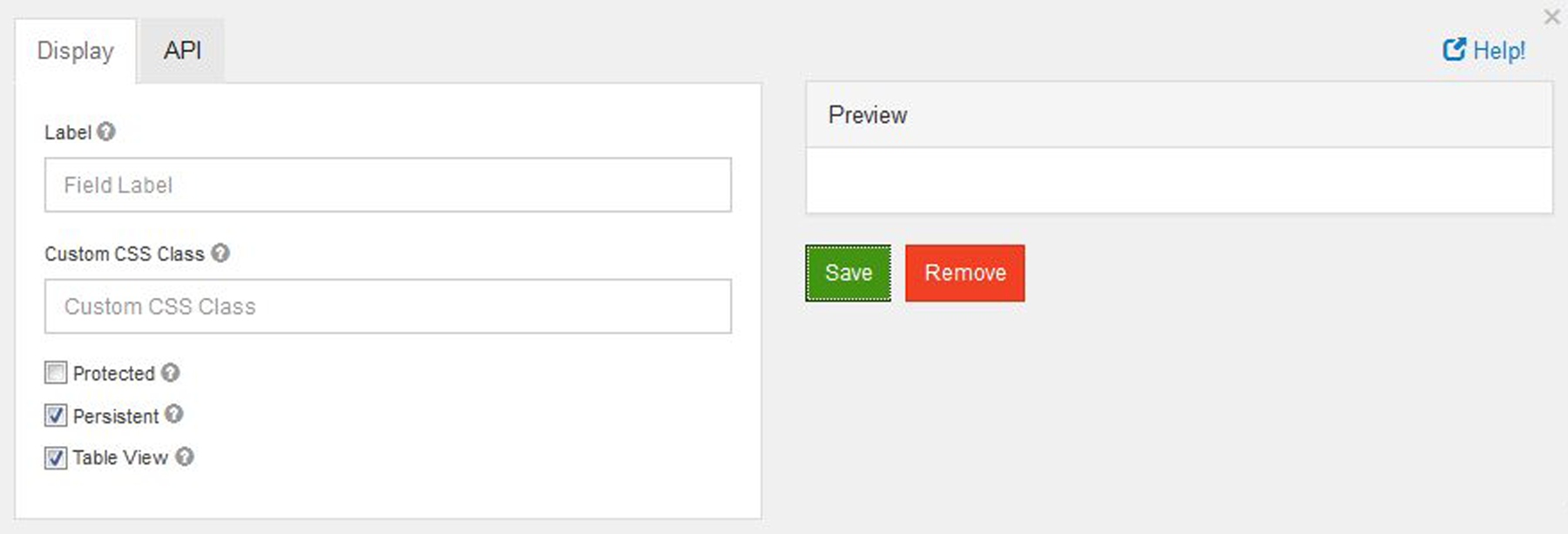
Label
The name or title for this component. Here label is only display at the time of creating or editing a form to represent container while adding form elements to it. It will later disappear in live.
Custom CSS Class
A custom CSS class to add to this component. You may add multiple class names separated by a space.
Protected
If checked, this field is for input only. When being queried by the API it will not appear in the properties and also should not appear in exported data. You won’t be able to see the value on form.io, but it will be stored in database under the hood.
Persistent
If checked, the field will be stored in the database. If you want a field to not save, uncheck this box. This is useful for fields like password validation that shouldn’t save.
Table View
If checked, this value will show up in the table view of the submissions list.
Data Grid
Data Grids allow users to add multiple components on to a line item grid. Once placed,
users can add multiple components inside of the Data Grid. Additionally, any number of grids can be added
within a form which is especially useful when needing the ability to add or duplicate multiple fields sets.
From the Data component menu, add the Data Gird (Array) to any active form. By default the grid is empty but can have other form components placed inside.
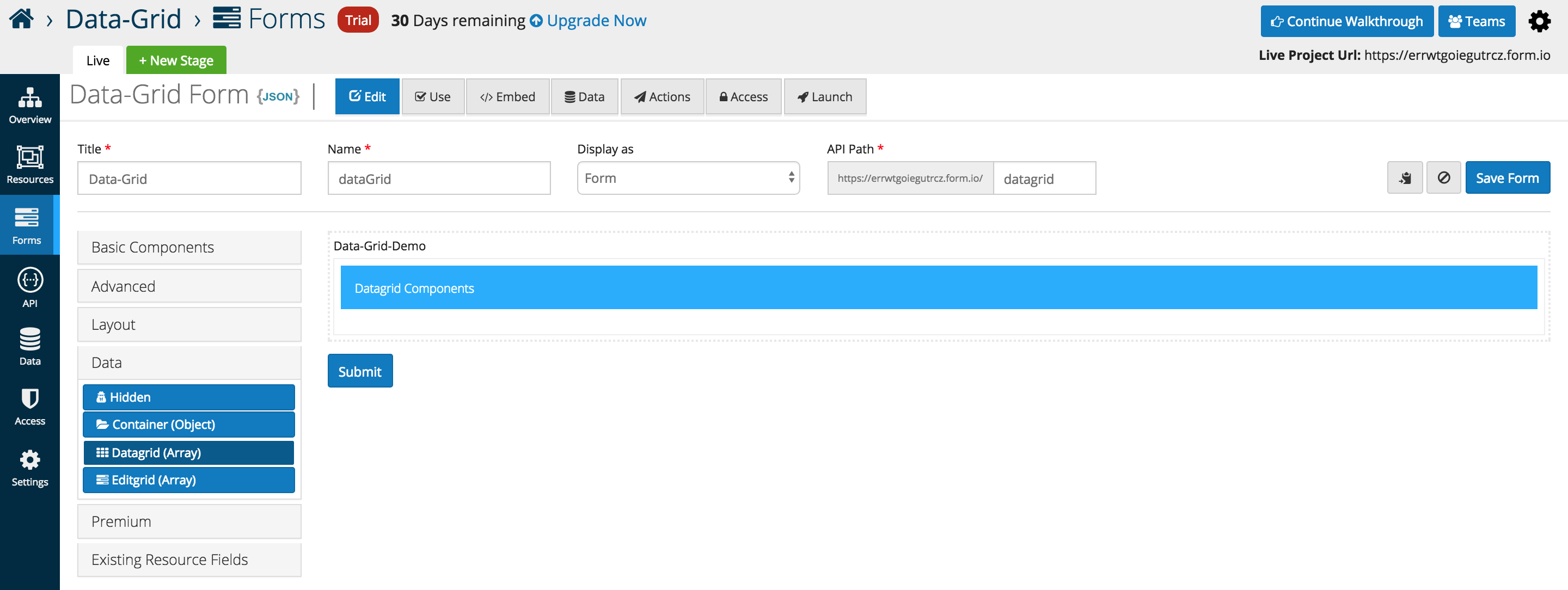
The example below illustrates three Basic Components placed inside of a Data Gird (Array). A new column is automatically added whenever another component is added the the data grid interface
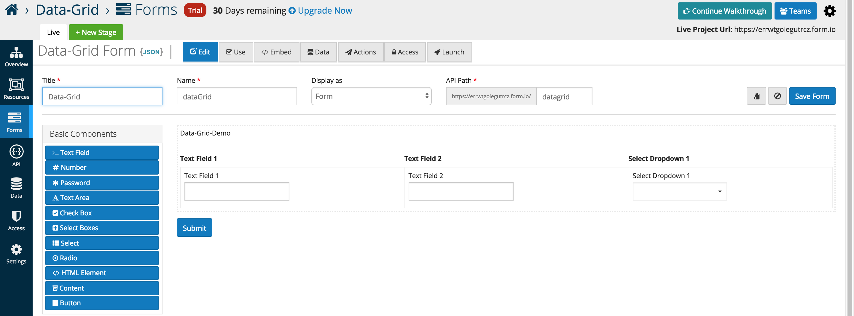
Below is an in depth look at the specific data grid options that users can add or interface with as of the 5.0.0 release.
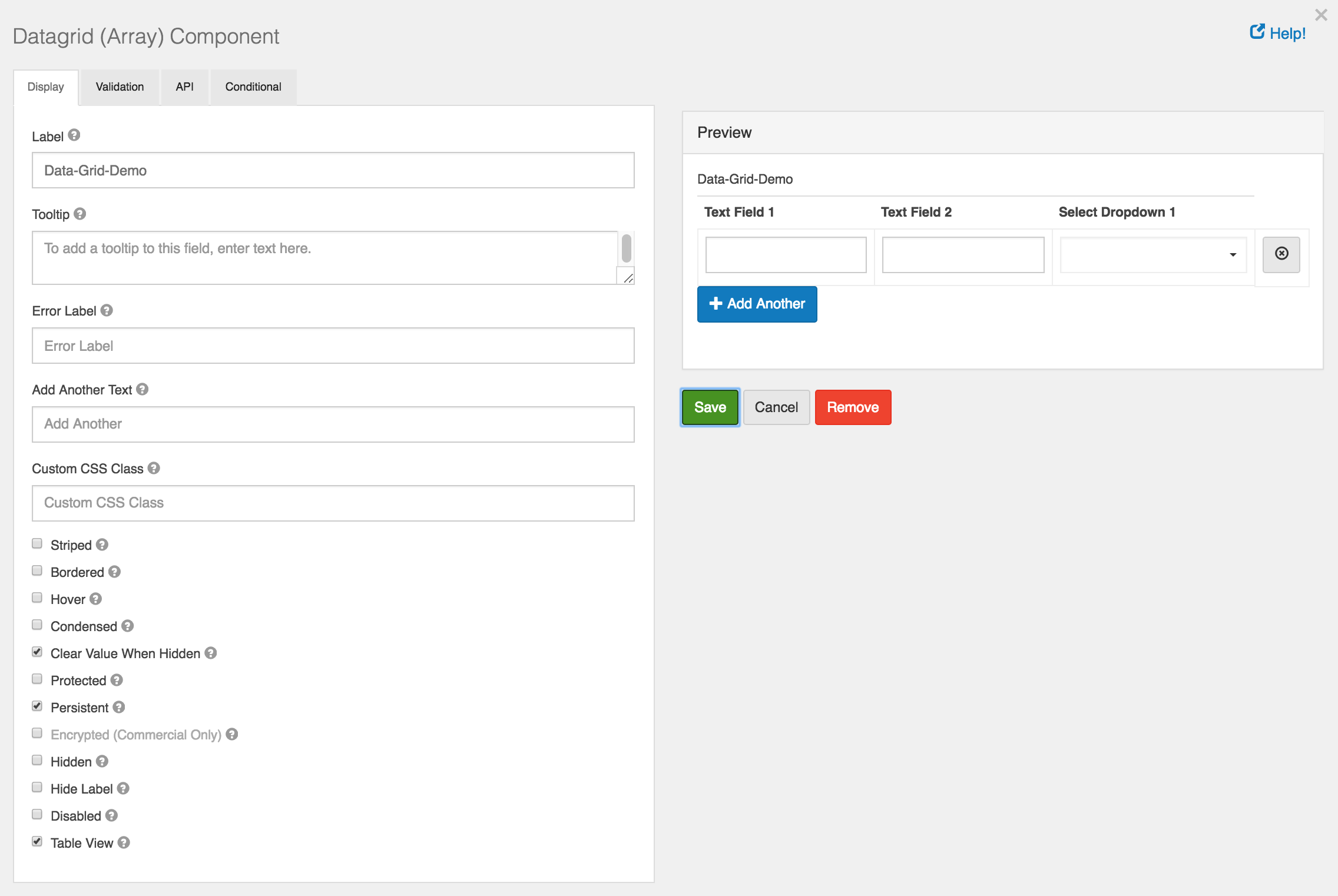
Add Another Text
- Text that will display for the Add Another button instead of the default.
Add Another Position
- Position for Add Another button with respect to Data Grid Array.
Striped
- Whether or not the table is striped for odd and even rows.
Bordered
- Whether or not the table has a border set on it. (This can be changed by your own CSS as well)
Hover
- Whether or not to add a hover class on rows when the mouse hovers over them.
Condensed
- Whether or not to condense the size of each sell by removing padding.
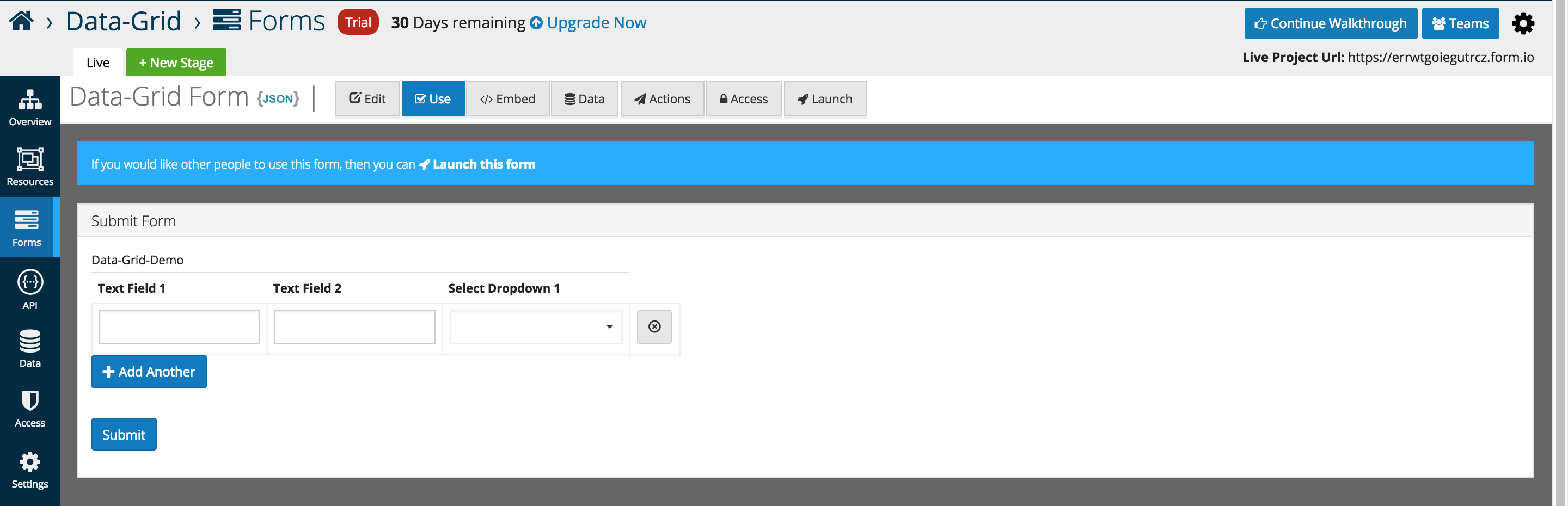
An example of the Data Grid displayed in the Use tab.
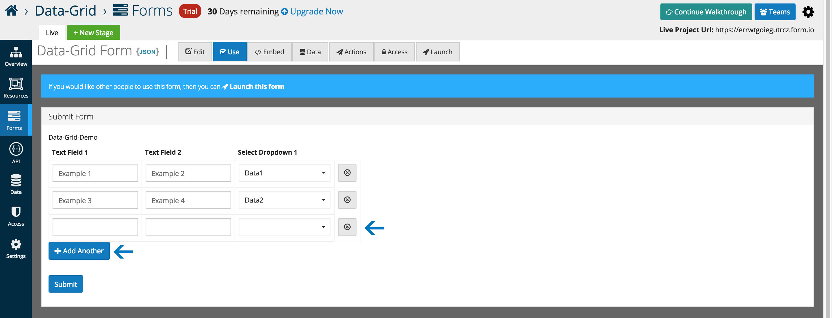
Rows can be dynamically added, and removed as highlighted below.
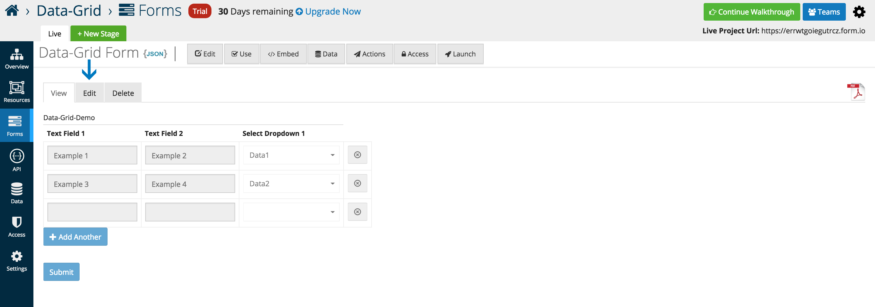
Data can be submitted and edited via the traditional platform interfaces.
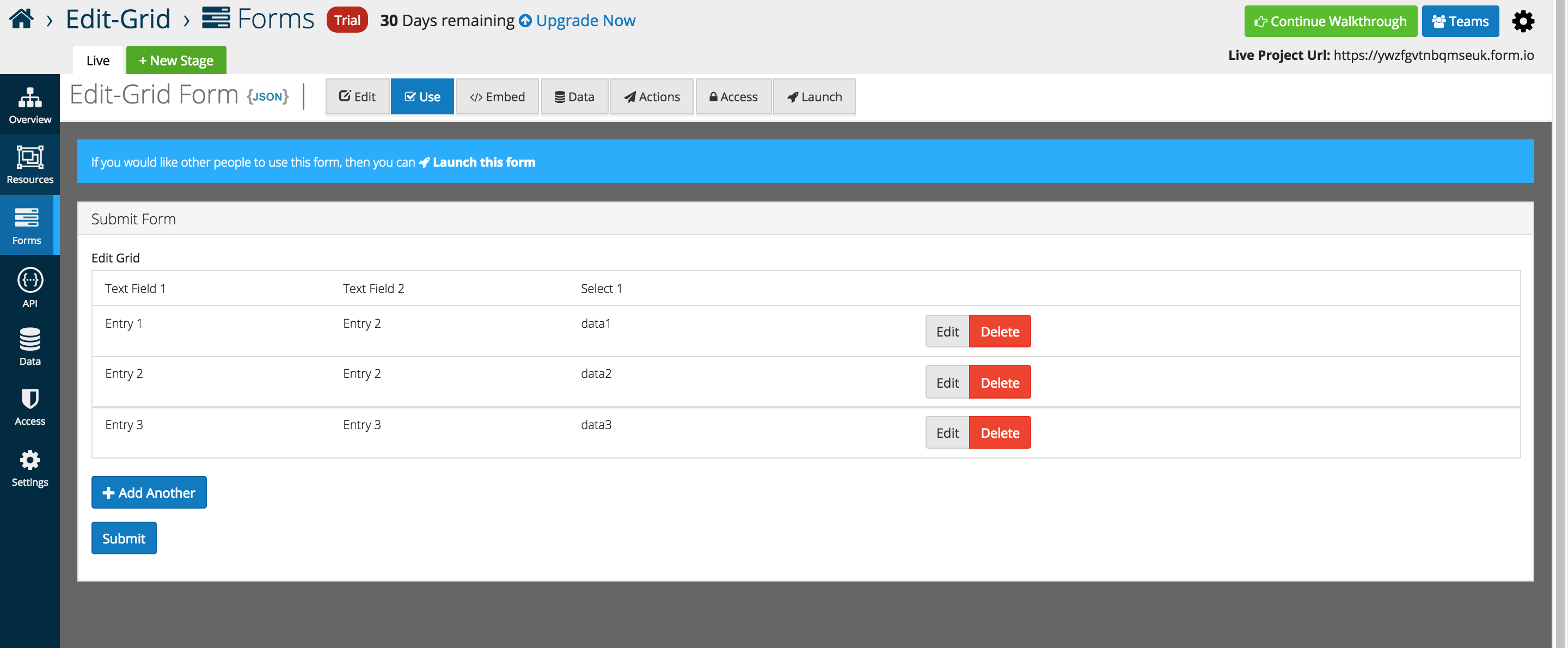
Edit Grid
Edit Grids allow users to replicate an table like structure when it comes to the capture and display of form data. Users can add multiple components inside of the Edit Grid. Additionally, any number of grids can be added within a form which is especially useful when needing the ability to add or duplicate multiple fields sets.
From the Data component menu, add the Edit Gird (Array) to any active form. By default the grid is empty but can have other form components placed inside.
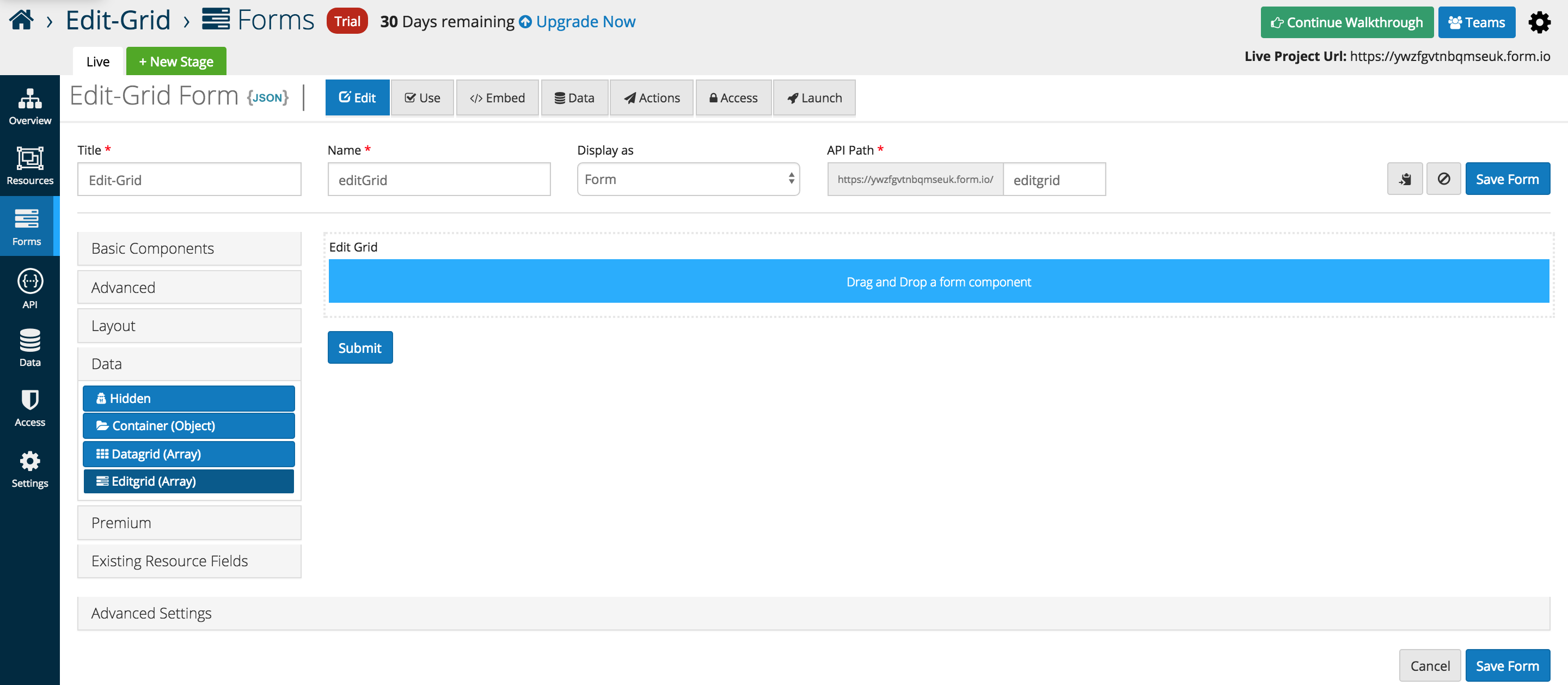
The example below illustrates three Basic Components placed inside of a Edit Gird (Array). Layout components can be used to replicate the split view below, and additional rows are added automatically when additional form elements are dragged into the interface.
Below is an in depth look at the specific data grid options that users can add or interface with as of the 5.0.0 release
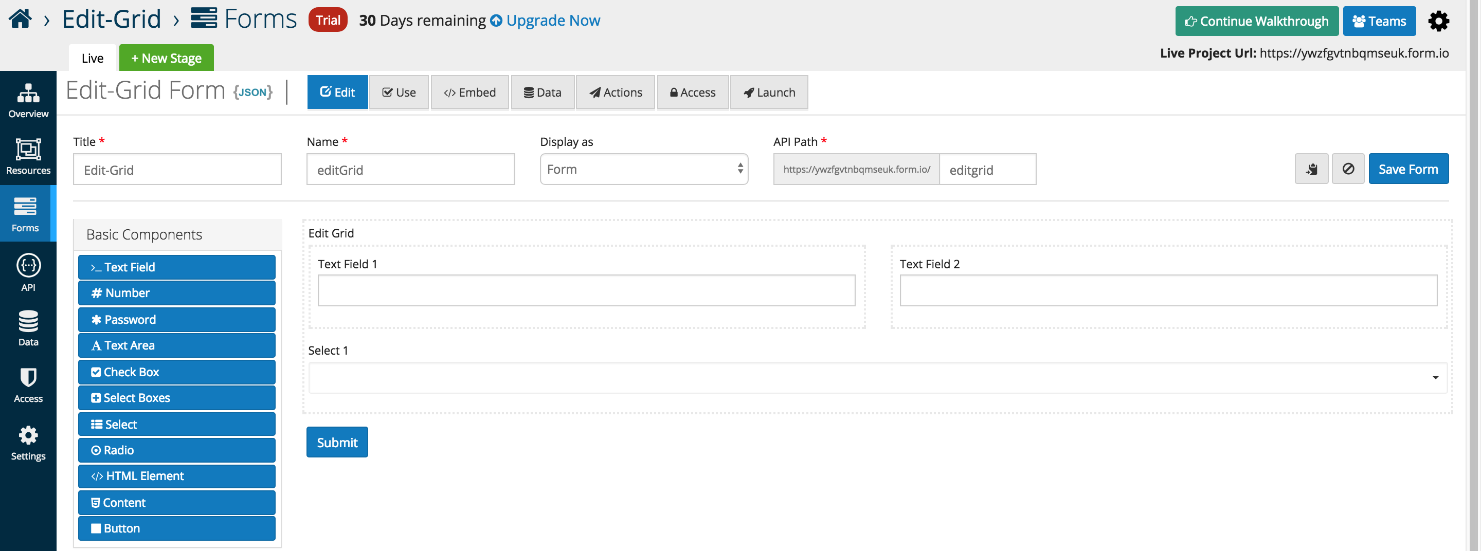
Templates
Edit Grid gives the user the flexibility to customize the grid to how they see fit using basic JavaScript. Within the Template section of the component settings, the user can modify what type of components are displayed within the grid row along with the Header/Footer.
Row CSS Class
CSS class to add to the edit row wrapper.
Add Another Text
Set the text of the Add Another button.
Save Row Text
Set the text of the Save Row button.
Remove Row Text
Set the text of the remove/delete Row button.
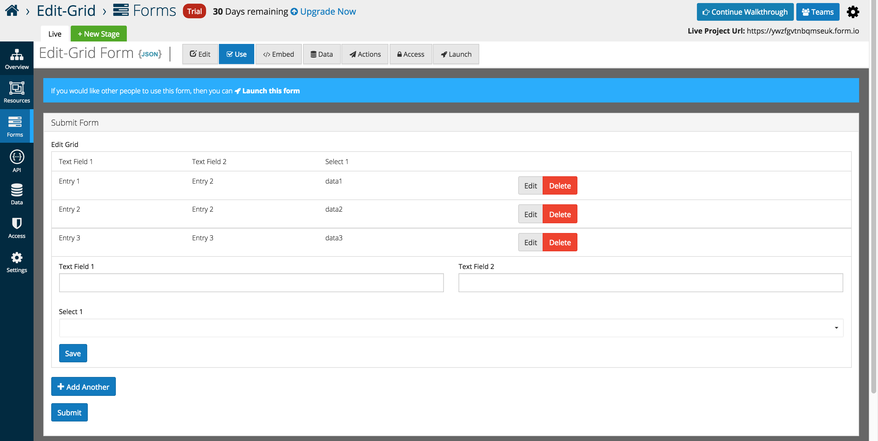
An example of the Edit Grid displayed in the Use tab.
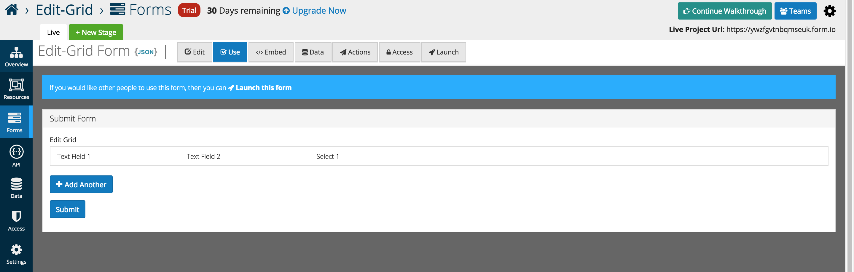
As Entries are added the table displays the data below each respective header independent of the form layout.
The form layout is displayed when Add Another is pressed, and the form appears below the grid for user entry.
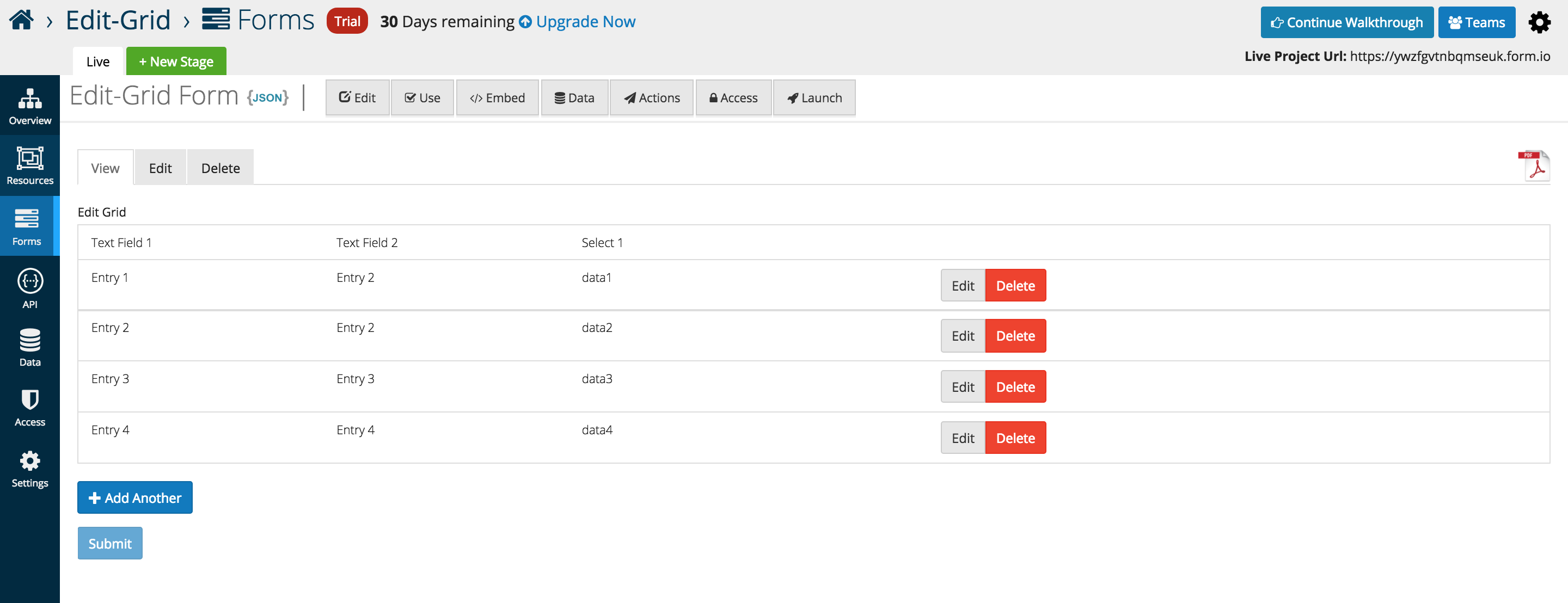
Once submitted, form data can be viewed and edit via traditional platform methods.
File
A file field allows users to upload and download files to a form. In order to use a file field, file storage must be set up. This can be done from the project settings. See File Storage for the types of providers supported.
Form.io does not host any files itself. Files are stored on the storage provider which allows uploading and downloading files to and from it. Form.io only stores a reference to the files which allows seamless integration into your app.

Label
The label for this field that will appear next to it.
Storage
This is the storage provider where the file will be stored and accessed from. Select the appropriate provider. All providers besides Url require additional configuration in project settings.
Upload Url
If Url is selected in Storage, enter the Url of the service. It must be compatible with the ng-file-upload service and return an object that includes the url to access the file.
Directory
This field will append all files with the string so that they are in a directory on the storage provider. Must end in “/”.
Custom CSS Class
A custom CSS class to add to this component. You may add multiple class names separated by a space.
Tab Index
Sets the tabindex attribute of this component to override the tab order of the form. See the MDN documentation on tabindex for more information on how it works.
Multiple Values
If unchecked, only one file per field is allowed. If checked, multiple are allowed.
Protected
If checked, this field is for input only. When being queried by the API it will not appear in the properties and also should not appear in exported data. You won’t be able to see the value on form.io, but it will be stored in database under the hood.
Persistent
If checked, the field will be stored in the database. If you want a field to not save, uncheck this box. This is useful for fields like password validation that shouldn’t save.
Table View
If checked, this value will show up in the table view of the submissions list.
Webcam Feature
We have additional File component settings that are currently on our Beta site. This includes a Webcam feature which allows the user to utilize the webcam on their local machine to take a picture and upload to the component.
To apply this feature, navigate to https://beta.form.io/. Ensure you have correct file storage configuration within the stage settings. Set your file component to the correct storage type and click the ‘Enable Web Cam’ setting.
When using the form, you will see a ‘Camera’ button on the component. Clicking the camera button will activate your webcam enabled on your local machine with the ability to take and upload photos.
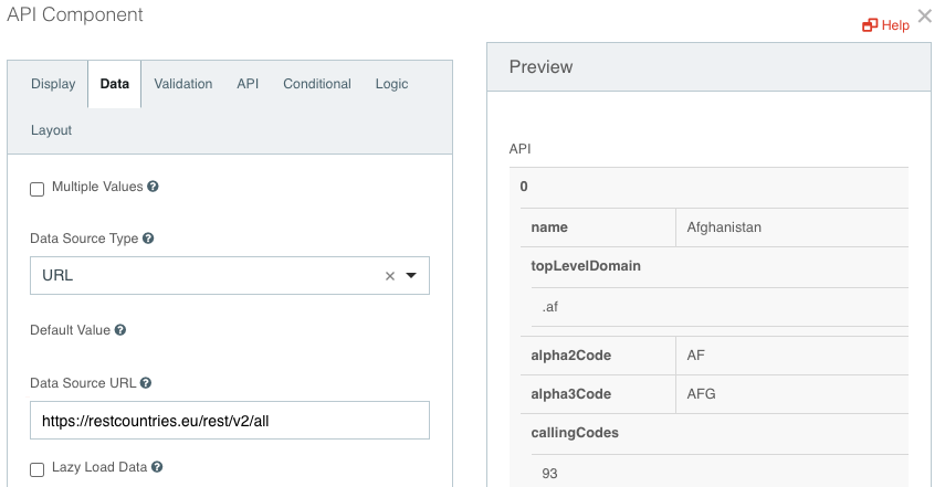
API
An API field can be added to a form to get the data from any REST API source. The data returned by the API will be visible in the form.
Label
The label for this field that will appear next to it.
Data Source Type
Select URL as the data source type.
URL
Enter the URL of the source.
Data Path
The JSON key that you want to display in the form
Value Property
The property that will be saved on form submission
Required
If checked, the field will be required to have a value.
Page
A Page field can be added to a form to embed the page in the form. All the relevant data from the page will be rendered in the form.
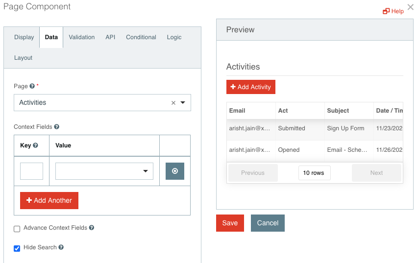
Label
The label for this field that will appear next to it.
Page
Select Page to be embedded
Context Fields
The form fields can further be passed to the child forms of the page. Select the key that needs to be passed as context.
Hide Search
This will hide the search and filter fields from top of the form. All records will be loaded by default.