Layout Components
Layout Components are used to change the general layout of the Form.
HTML Element
An HTML Element component may be added to a form to display a single HTML element. This is useful if you wish to quickly insert and configure some HTML in your form. All unsafe HTML is stripped before rendering to prevent cross-site scripting exploits. This includes tags like <script>, <embed>, and <style>, and attributes like onmouseover or onload.
If you wish to insert more complicated HTML in your form, see the Content component
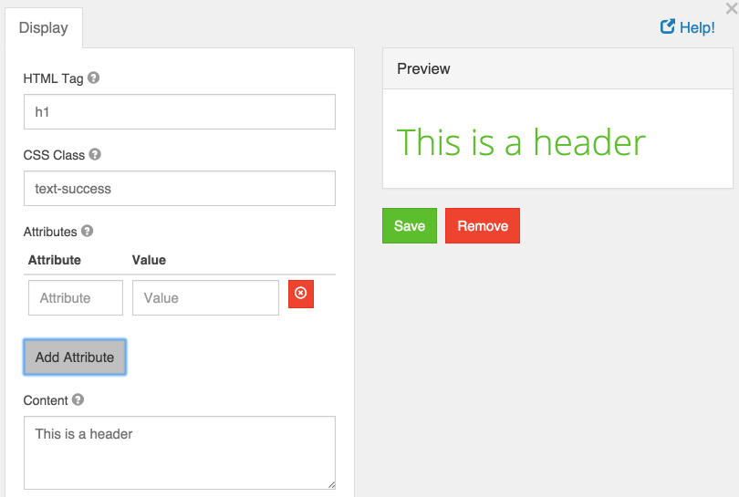
HTML Tag
The name of the HTML tag to display.
CSS Class
The CSS class to add to the HTML element. You may specify multiple classes by separating them with single spaces.
Attributes
Attributes and their values to add to the HTML element. This is commonly used to add href attributes to <a> tags, or src attributes to <img> tags.
Content
The text content of the HTML element. While adding more child HTML tags here will properly display them, it is recommended you use the Content component to easily write and preview more complex HTML.
Content
Content may be added to a form to provide non-field information. For example, if you need instructions at the top of a form that are for display only, use a Content component. There are no settings for a Content component and the value is not submitted back to the server.
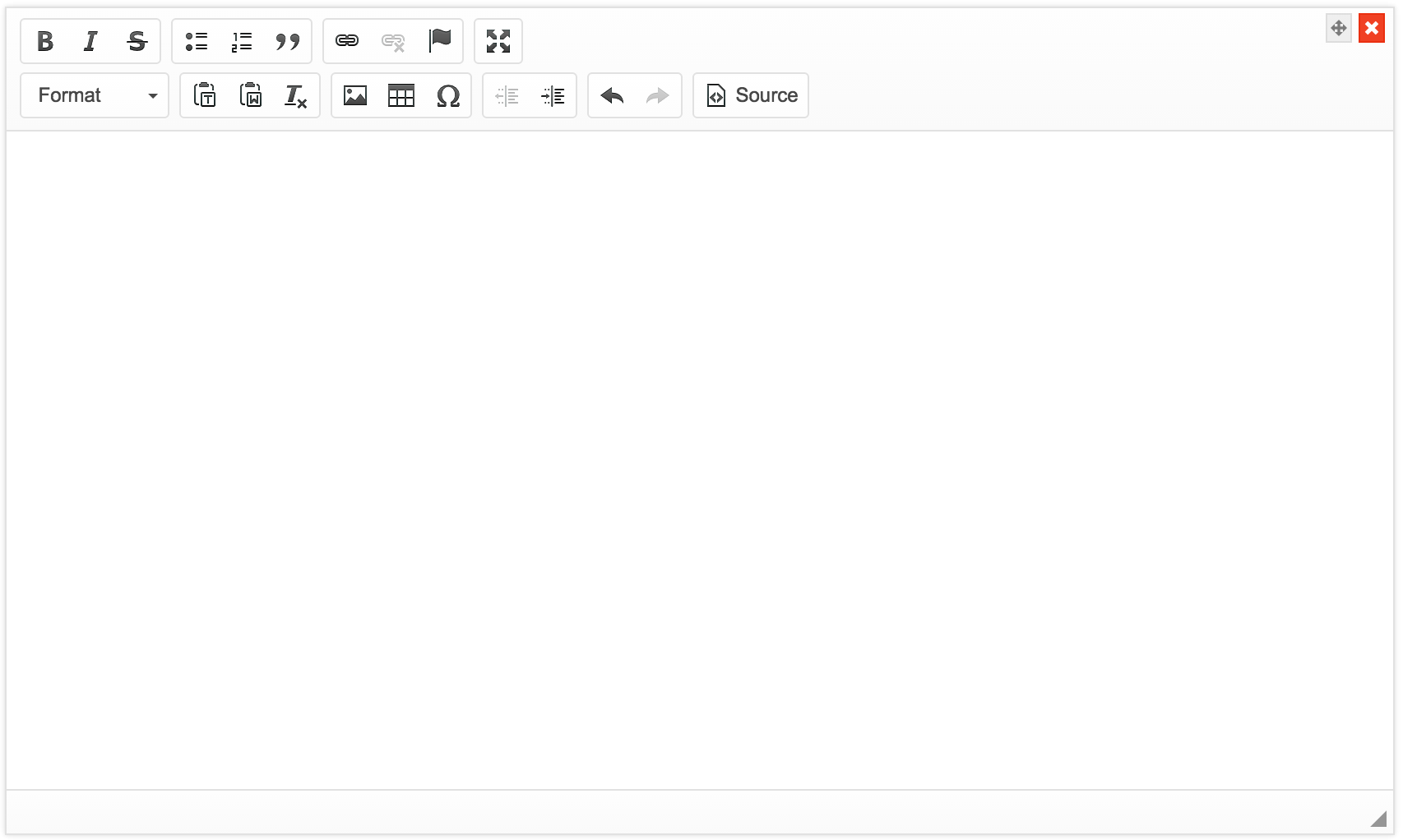
A WYSIWYG editor has been provided to help with formatting the content. If you use the HTML view of the editor, note that all unsafe HTML is stripped before rendering to prevent cross-site scripting exploits. This includes tags like <script>, <embed>, and <style>, and attributes like onmouseover or onload.
Columns
The Column layout component can be used to split any area into two columns. Simply drag and drop the Column button onto the form and the area you drop it on will be split in two.

Field Set
A fieldset can be used to create a title of an area of the form. This is useful to put inside Layout components or in between lots of related fields. This form component is display only and will not be saved to the api.

Fieldset Legend
Enter the legend that will appear for the fieldset.
Custom CSS Class
A custom CSS class to add to this component. You may add multiple class names separated by a space.
Panels
Panels are used to wrap groups of fields with a title and styling. These currently map to Bootstrap Panels.

Panel Title
Enter the panel title that will be displayed at the top of the panel.
Theme
The theming of the panel. Select one of the options to have the class added to the wrapper div.
Custom CSS Class
A custom CSS class to add to this component. You may add multiple class names separated by a space.
Table
The table component allows creating a table with columns and rows that allow adding additional components within it.

Number of Rows
The number of rows on the table. This can be adjusted at any time.
Number of Columns
The number of columns on the table. This can be adjusted at any time.
Custom CSS Class
A custom CSS class to add to this component. You may add multiple class names separated by a space.
Striped
Whether or not the table is striped for odd and even rows.
Bordered
Whether or not the table has a border set on it. (This can be changed by your own CSS as well)
Hover
Whether or not to add a hover class on rows when the mouse hovers over them.
Condensed
Whether or not to condense the size of each sell by removing padding.
Please note - Tables may not repsond well when collapsing to a mobile interface. Please utilize the Column component for a mobile reponsive layout option